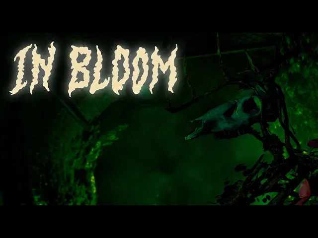
In Bloom
UX Case Study
CLIENT
School Project
SERVICE
UX/UI
YEAR
2025
TIME
7 weeks
Introduction
Goals
The goal I had while working with In Bloom was to design create UI and HUD systems that both reinforced the game’s tone and ensured usability, but that also were align with the games atmospheric and uncanny horror experience theme. This included creating tutorial prompts and ingame prompts that guided players smoothly through the gameplay, supporting clarity and immersion without breaking the intended mood.
Throughout the project me a UX designer had to navigate several challenges, many of which me my UX-colleague had anticipated early on. To stay aligned, we regularly discussed potential issues in advance and prepared solutions where possible. A key learning was the importance of remaining flexible and willing to adapt, which often meant letting go of ideas to serve the project’s broader goals. While communication dynamics required us to rely on intuition at times, we consistently grounded our design decisions in validated user insights. Despite the complexities, our vision stayed clear: to deliver a user-centric experience that reflected the needs of our target audience.
By combining our concept with the insights gained from competitor evaluations, I were able to clearly define our target audience. From the start, we had a strong sense of who we were designing for and the type of players we wanted to attract as our primary users.
Menus
The first thing I designed was the game’s menus, focusing on a minimalistic style to reinforce the survival horror mood. Starting with user flows and competitor research, I sketched, wireframed, and tested different layouts before finalizing the design. I chose left-aligned menu options for consistency and to highlight the atmospheric background.
The final design featured smooth transitions, text-based buttons with hover effects, and clear readability adjustments. I implemented these designs in Unreal Engine using Widget Blueprints, while collaborating with a programmer for functionality. Other menus such as pause, options, and game over followed the same principles.
Inventory
The whole inventory section was something that was never originally planned for initially, but had to be designed and implemented due to development taking a different direction. I were able to come up with some solutions that would make the Inventory slot fit in. The solutions I recommended were:
Same minimalistic style as the ammo counter
Fades in and out with the ammo counter
Curated to the maximum items at the same time
Due to time constraint the inventory system were close to be left out. And that would result in having no inventory screen or information regarding key-items. Leaving the player to remember all by themselves. This was a big No from me and my UX-colleague, so we heavily pushed iterations to the team in how to display and give the information for the player regarding key-items. Lifting up the positive impact it would have for the user experience.
Icons
The icons that are used in the game is very much like the inventory slot, not something that we initially planned for.
We struggled a bit with them since there where no information or decision to how many or what kind of items it was going to be, making our job designing them stagger.
We knew that there were gonna be some kind of key so we started with that icon, making it minimalistic and fit the rest of the ammo and inventory visuals.
Doing the rest when information came available, we prepped our coming work by looking up inspo on iconography that would match our established visual identity and started on mock-ups, thus making it easier once said information was available
The pick-up prompts in the game went through several iterations, with different kinds of shapes and indications, but all of them aligning into the same identity. Final result ending up into a merge of the different variations. This look is not only visaully appealing but also a clear indication on what can be interacted with and where said event is in the world space. On pick-ups, the prompt is also accompanied with a light glow to highlight it’s presence.
Damage vignette
The damage vignette idea came alive as soon as we pitched our concept of the world where vibrant flora is sentient, hostile, and consuming life itself. The idea was to have flora or branches slowly growing into the screen from the sides when the player took damaged, instead of the regular blood vignette you often see in horror games.
The vignette had some iterations to go through to find a design that aligned with our games visual identity.
The designs where first done in Canva to get a feeling ot how it would work, then later made in unreal engine with assets we used in the game.
One wish was to make it “grow” in to the screen, but due to our teams different experience we had to settle with the vignette as a fade in by damage instance the player took instead, acting as a compromise to get the vignette to function.


